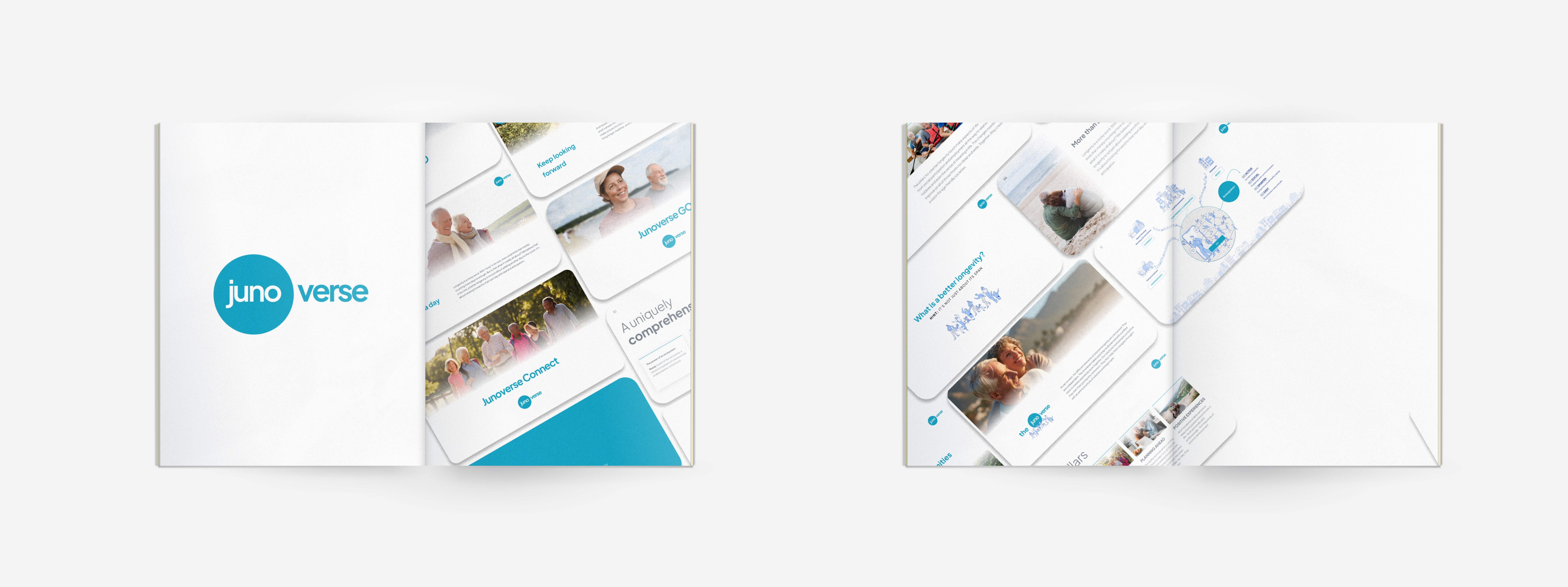
Logo specifications
Initially, the company bore the name Juno, an homage to the immortal Roman goddess symbolising youth, beauty, and vitality.
As we continued to refine our mission, we realised it was about more than just a single solution. It was about creating an entire universe, an ecosystem of solutions. This inspired the birth of 'Junoverse'.
Typography
The typography chosen is Plus Jakarta Sans, and the reason of this is to be aligned with the brand, but also with the message. Another key point on the election of it remains on the target audience, and the accesibility that the products should reflect.
Colour palette
Junoverse's blue is the main colour of the entire ecosystem, from the logo to every main button or call to action.
The black also appears to be as a primary, and then two tonalities of blue make the entire ecosystem works consistently.
Images
In this created mood board, you'll find a selection of images specially chosen to shape our brand. Each image is a visual representation of our company's essence, reflecting our mission and purpose.
The focus is on showing senior individuals not just living but, more importantly, savouring life to the fullest. That’s the Junoverse.
Some of this images took a different relevance and also became the main picture of our products.
Brand personality
Our brand personality is sincere, humble yet confident in what we stand for and what we do. It is a true, honest reflection of who we are as a company.
Our voice is clear, confident, and warm across all brand touch-points, online and offline. It is a natural extension of our personality and the way it is conveyed to our customers and the broader community.


