E-Learning APP

Design a trustworthy, on the go e-learning app for ambitious and busy profesionals

E-Learning APP

Design a trustworthy, on the go e-learning app for ambitious and busy profesionals

E-Learning APP

Design a trustworthy, on the go e-learning app for ambitious and busy profesionals

Overview

For this project the challenge was to create an E-Learning platform in one week, taking into account all the steps of the design process, as well as the business plan.

Role

As the UX/UI Designer on this project, I was responsible for completing the entire design process, which involved conducting comprehensive research, crafting intuitive user experiences, and refining the final product based on iterative testing.

Research

Research in this case starts in the most general way: understanding what an e-learning platform is and how it works. I've conducted benchmarking on platforms like Udemy, Domestika, and Coursera (primarily on mobile). I needed to see how they operate, perform, their different features, and everything I could find to gain a deep understanding of them.

Main concept: E-learning platforms are a virtual learning space aimed at facilitating the online training experience, both for companies and individuals.

Then, I started with the stage of surveys and interviews to understand the behavior of users regarding this product, as well as the needs and concerns they had in terms of learning. The scope of the research was people between 20 and 40 years old.

Research

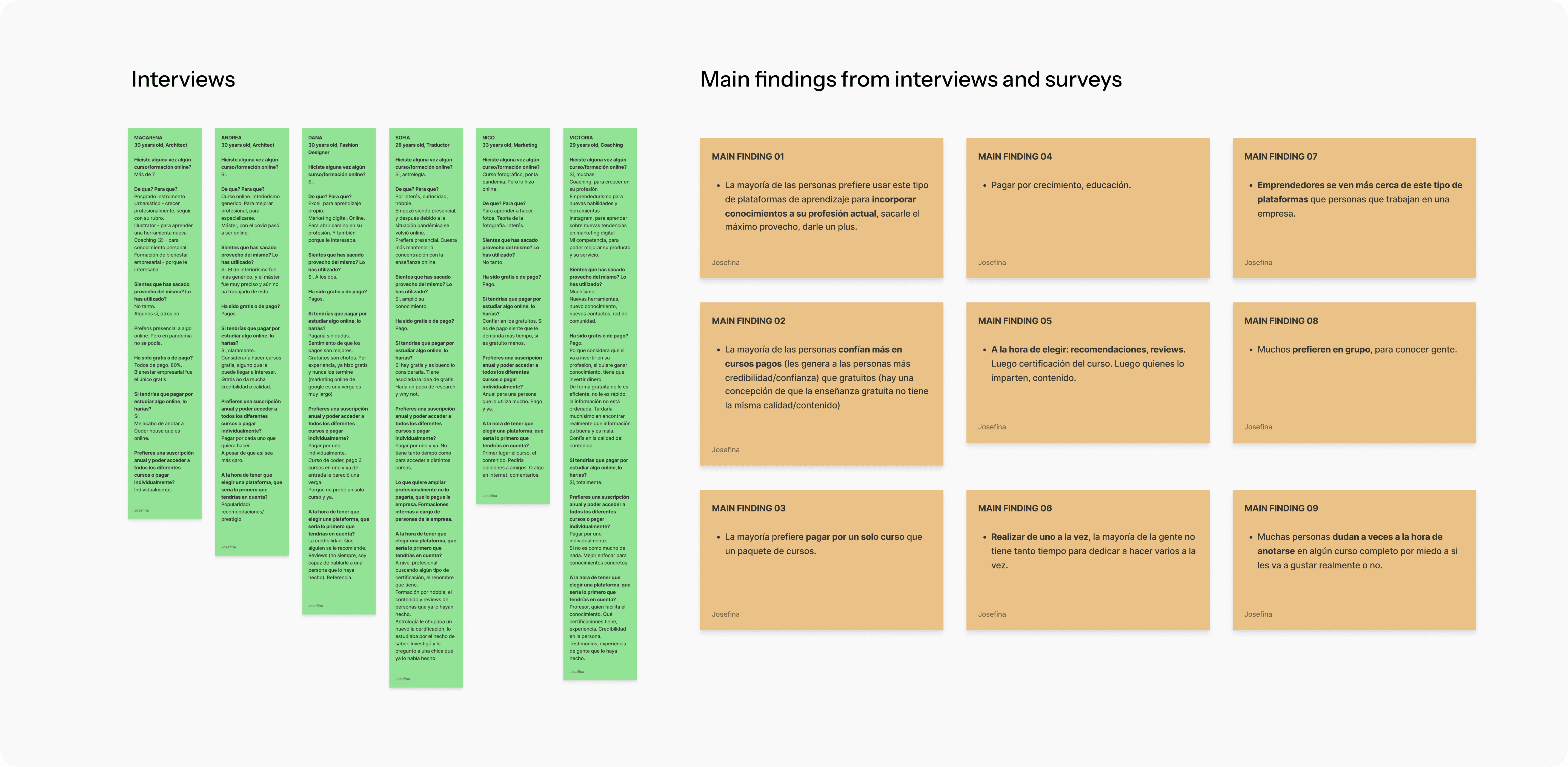
Interviews were conducted with six different types of users, trying to gather as much information as possible. This enabled us to centralise the key insights for prioritisation and progression of the project. Surveys were also conducted, but with more open-ended questions since they were more generic in nature.

General data was obtained from both the interviews and the surveys, such as:

Research

Key insights from research
- When choosing, recommendations, reviews.
- Perform one course at a time.
- Many users hesitate to sign up for a full course for fear of whether it's going to be worth it or not.
- Most trust on paid courses.
- Most users prefer to pay for individual courses rather than a package of courses.
- Need to feel confident and secure about the content.

Structure

I've planned the project by identifying the main problem, creating a user persona, and generating ideas for the solution.


Problem Statement
Many users hesitate when choosing a course due to a lack of reviews and recommendations. They want to read about the experiences of users who have already taken it.

Idea
Design and create a trustworthy e-learning platform based on reviews from real users who have previously used the product.

Product

User Journey
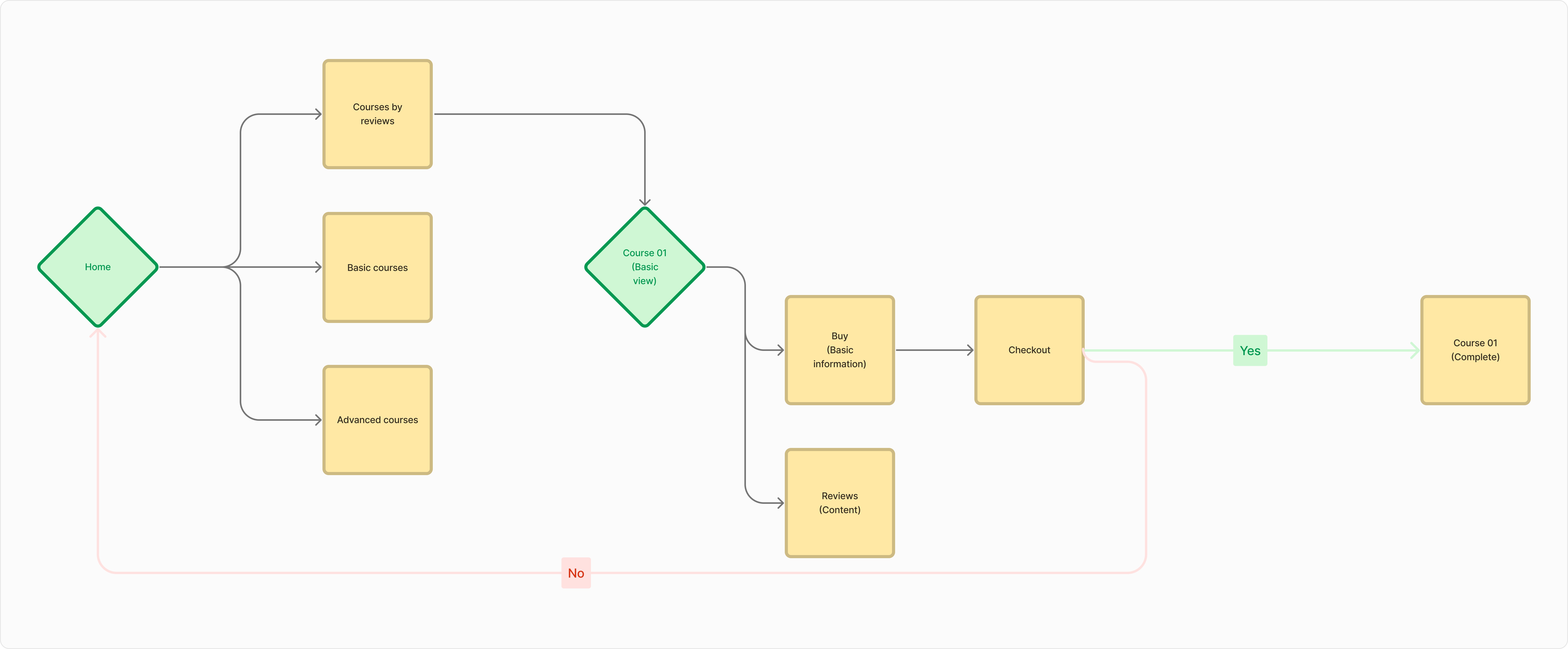
The development of the product began with the creation of the user journey, mapping out the main flow to understand the process from opening the app to the final objective of purchasing a course.

Product

Mid-Fi Prototype
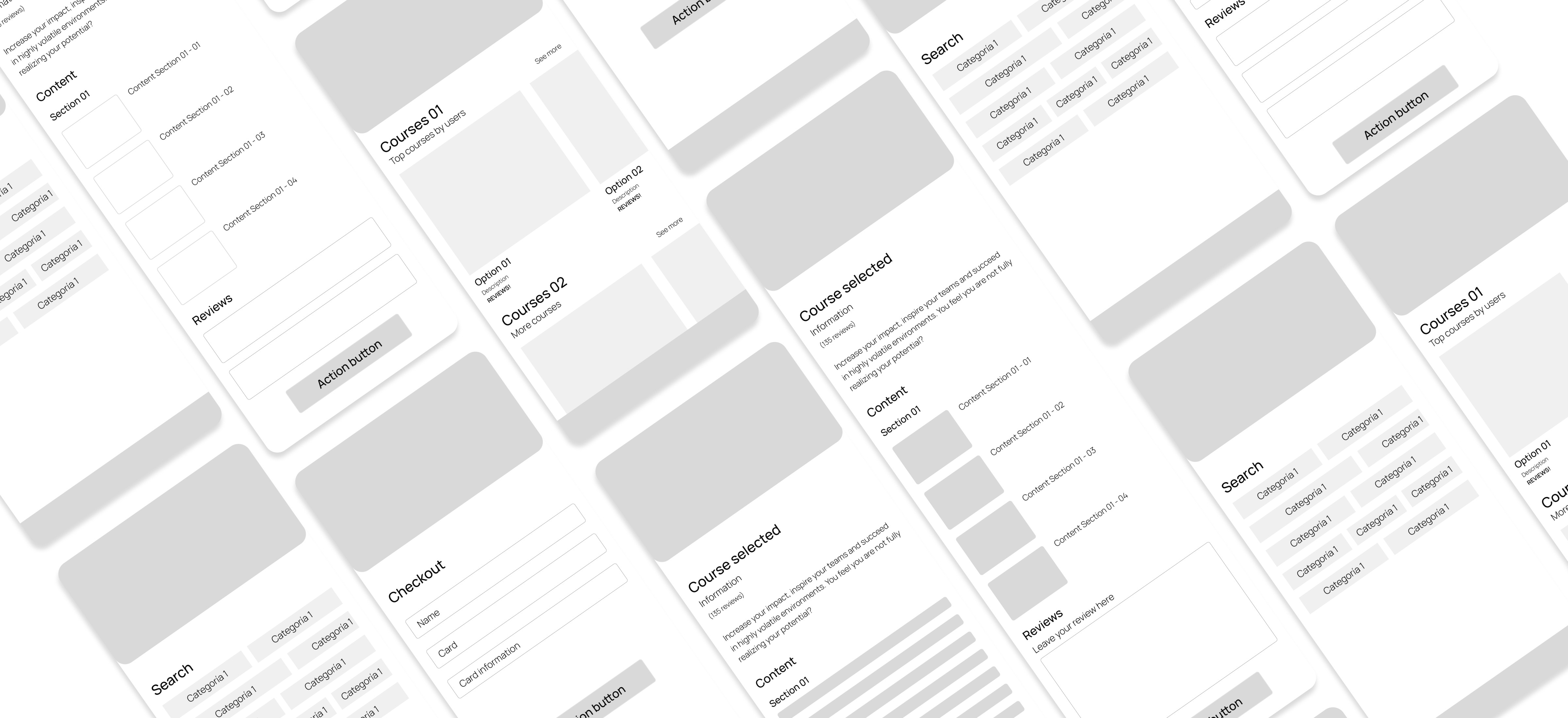
With some of the benchmark done initially, and with the user journey I was able to craft some of the main initial screens developed doing Mid-Fi for this first type prototype. Before jumping into details and applying visual designs, I wanted to be able to do some test and at least, get the first validation of this MVP. The greyscale remain and the basic shapes also, to be more effective when switching to the final product.

What we got from here?
The flow is really easy and intuitive, due that it has no complications in general for the user. But, doing usability testing showed me as well that our prioritisation of ideas were not clear; reviews didn’t had the relevance needed to be the key of this platform. Since this was the most important element of this MVP, we needed to review some of the steps.

Visual Design

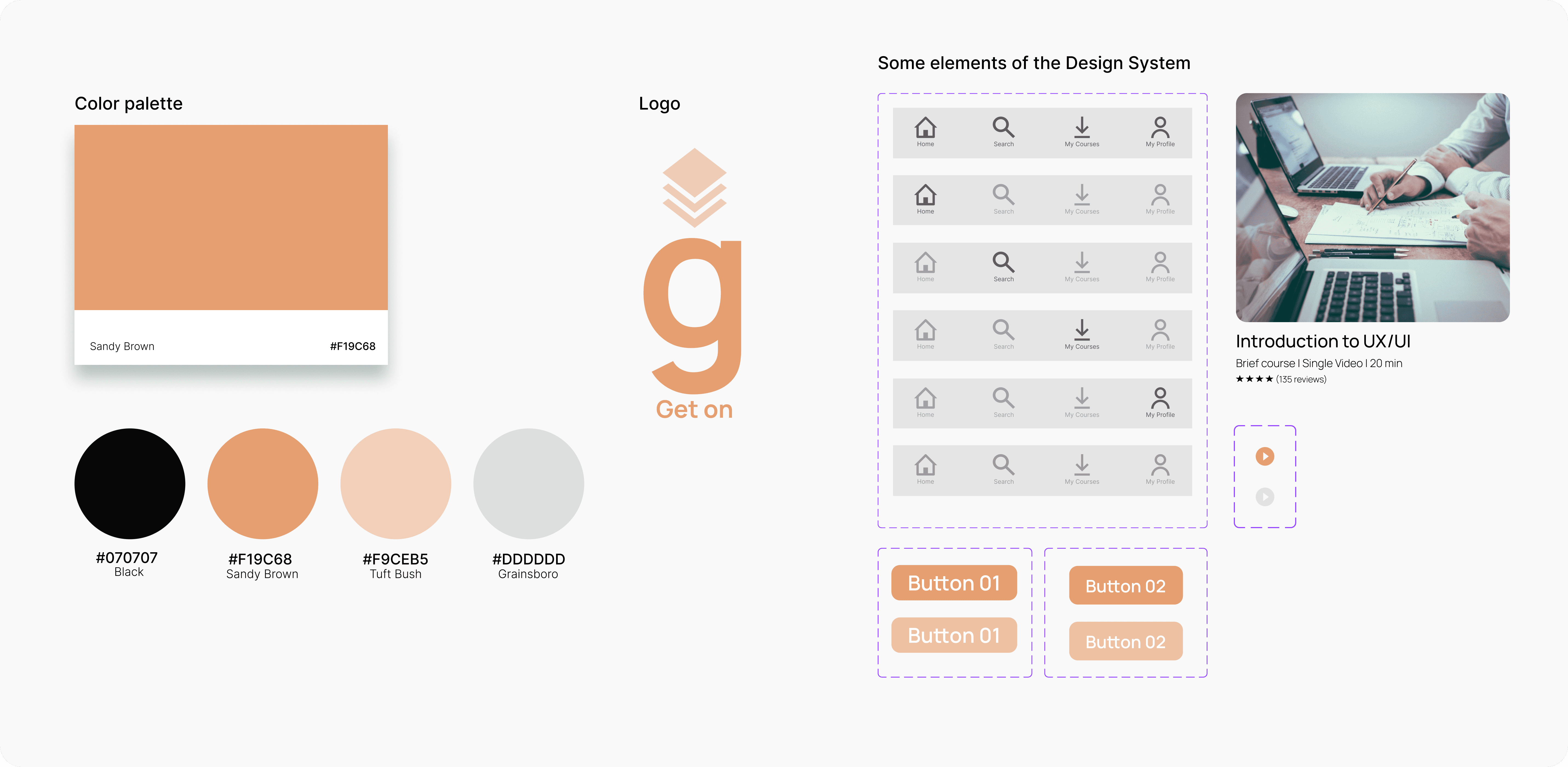
To build the brand identity for this project, a colour scheme was formulated on one hand and a logo on the other. As per the name and logo, the term “get” consistently had a strong presence from the beginning, quite intuitively. That's how the name of the APP take shape "Get On".
Every distinct section that the APP was to showcase would be guided by this term:

Get Trends (top courses per users - provided via their reviews)
Get Initiated (basic and introductory courses)
Get Advanced (comprehensive and highly focused courses)

In terms of colour, a palette in the orange hue was chosen, since it is a colour that denotes enthusiasm, determination. It is true that as a secondary colour I've tried to choose something that is not visually disruptive and that can easily combine, in this case, grey.

As well, some components were created to start building our Design System, and when crafting the High-Fi Prototype be more effective and coherent. In the following image there's only a few of them, trying to showcase how everything will look like.

To build the brand identity for this project, a colour scheme was formulated on one hand and a logo on the other. As per the name and logo, the term “get” consistently had a strong presence from the beginning, quite intuitively. That's how the name of the APP take shape "Get On".
Every distinct section that the APP was to showcase would be guided by this term:

Get Trends (top courses per users - provided via their reviews)
Get Initiated (basic and introductional courses)
Get Advanced (comprehensive and highly focused courses)

In terms of colour, a palette in the orange hue was chosen, since it is a colour that denotes enthusiasm, determination. It is true that as a secondary colour I've tried to choose something that is not visually disruptive and that can easily combine, in this case, grey.

As well, some components were created to start building our Design System, and when crafting the High-Fi Prototype be more effective and coherent. In the following image there's only a few of them, trying to showcase how everything will look like.

Solution

Final Product
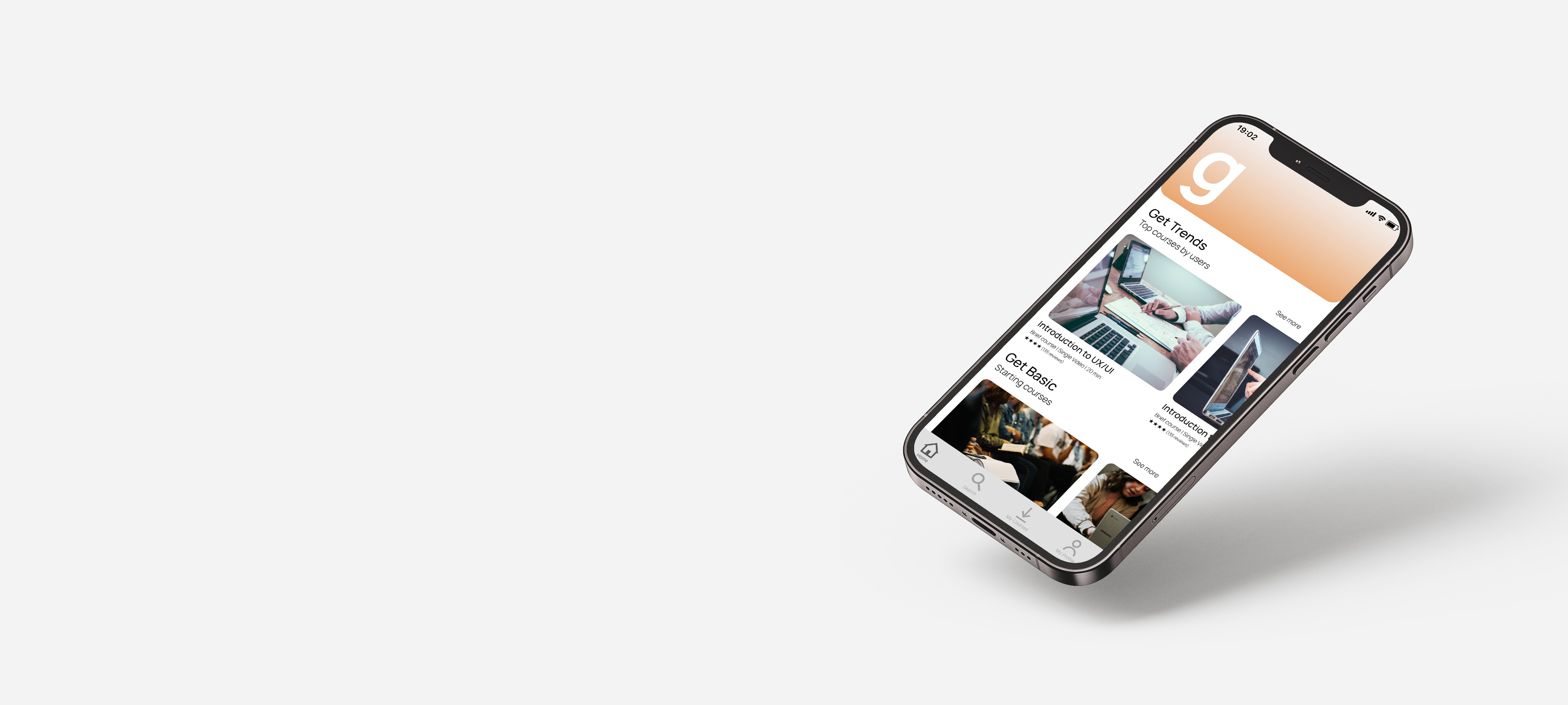
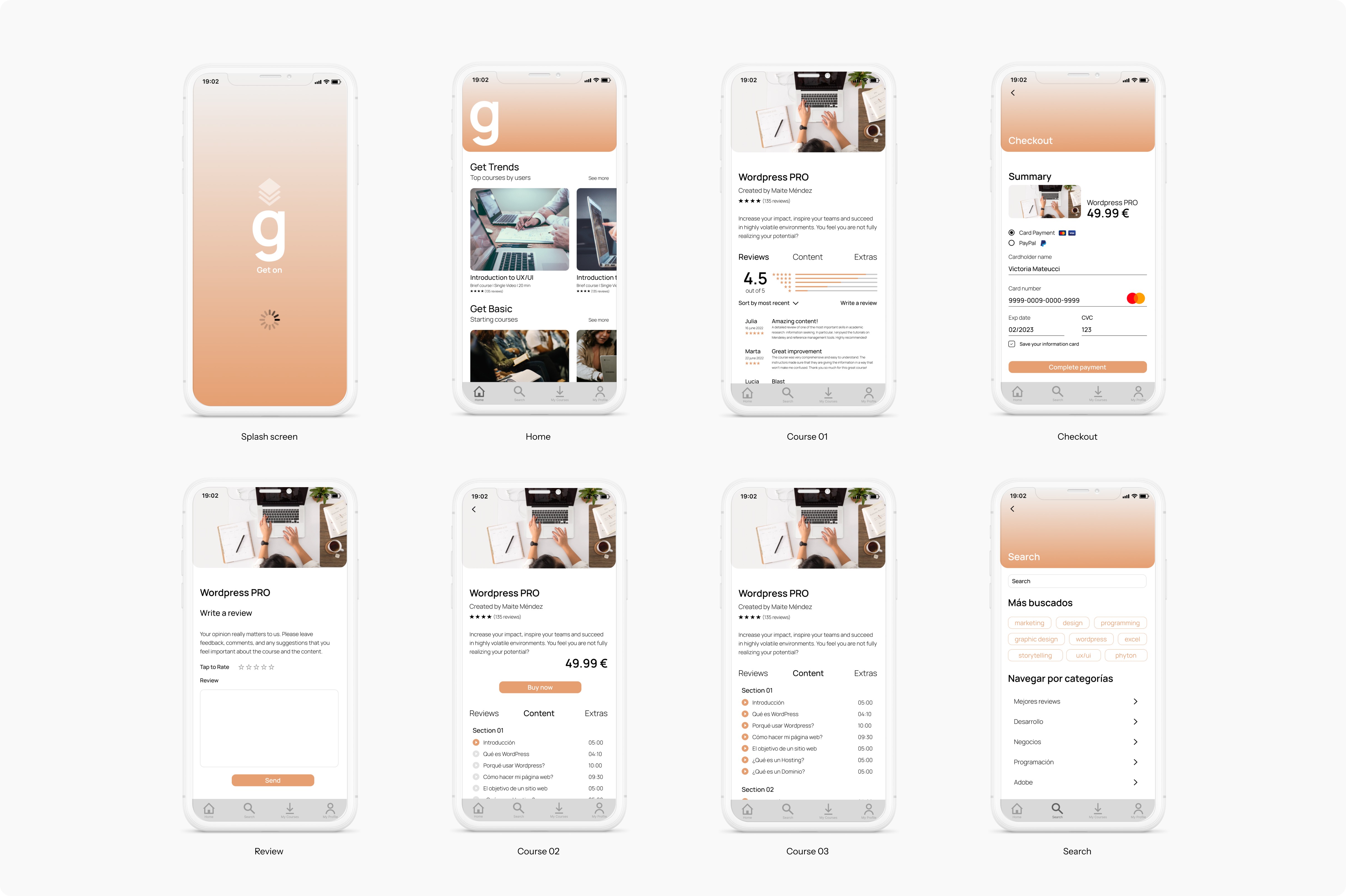
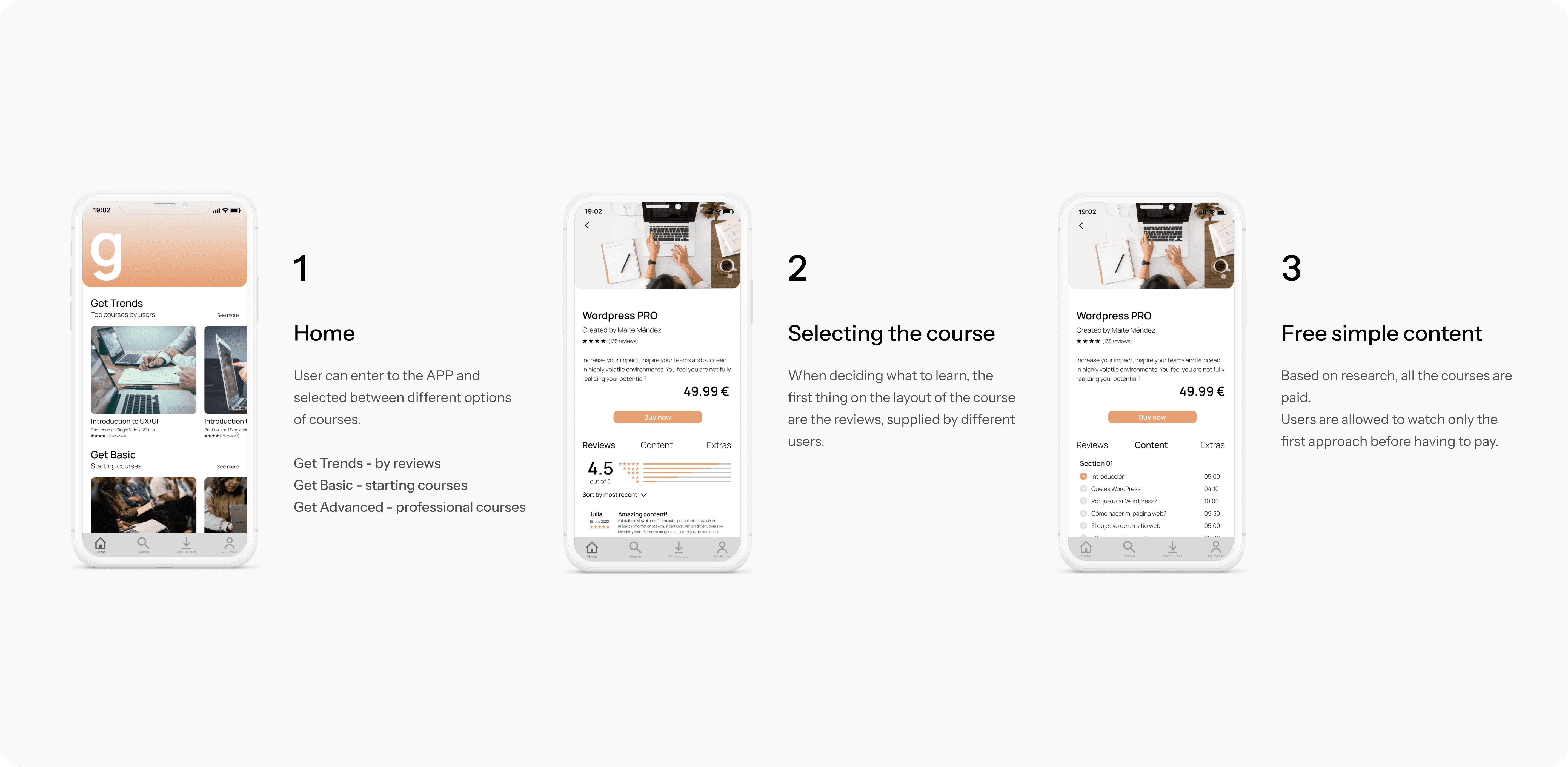
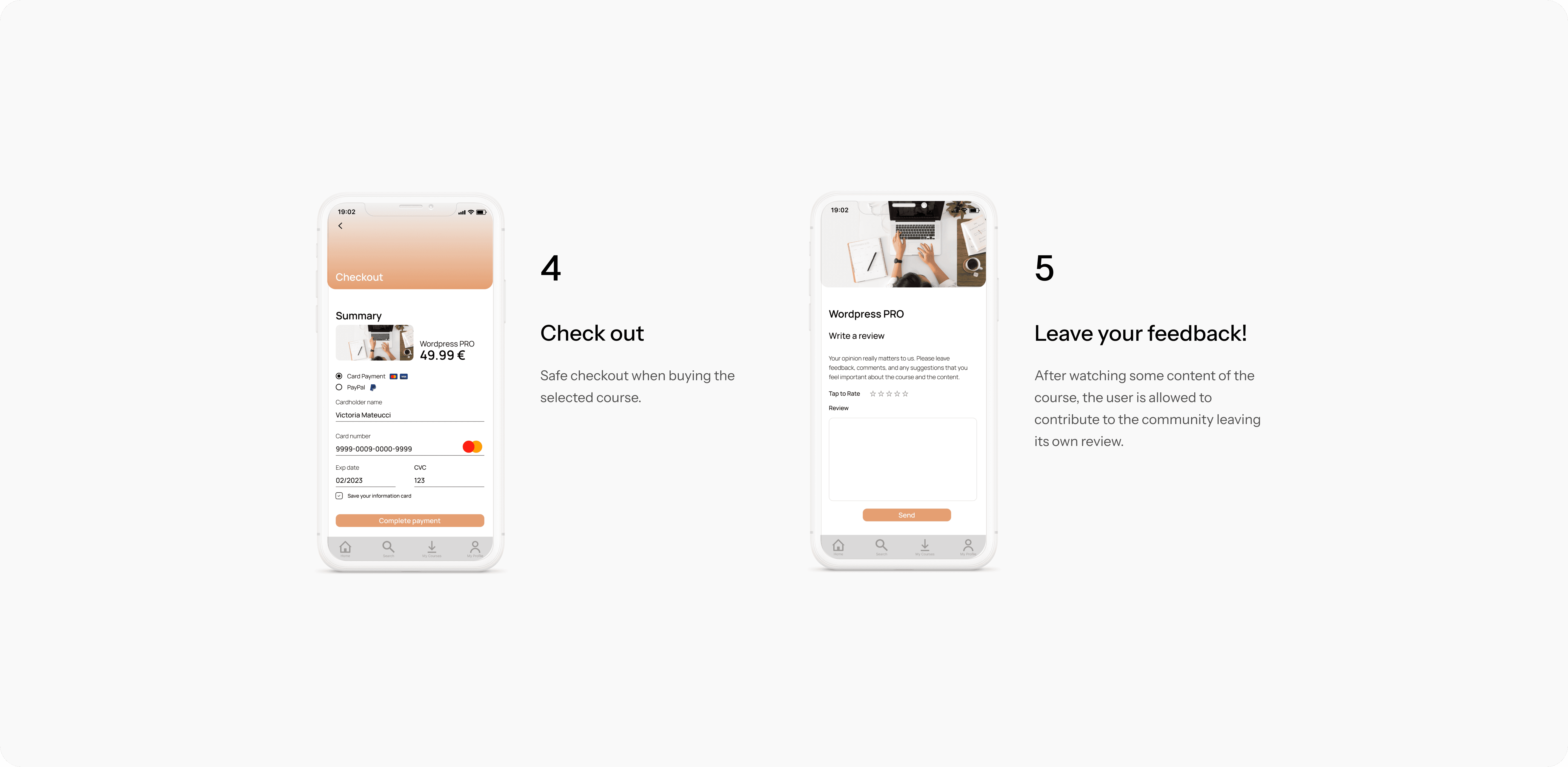
By doing Mid-Fi Prototype and testing with users, and using some of the elements and components created on the Design System, arriving to the final product was more easy and quick. Some of the main screens are showed here, trying to keep a simple style, but being loyal to the visual decisions made before.

Key Iterations

As we explained previously, conducting User Testing allowed me to organise the final product and understand the user's behaviour in its presence.

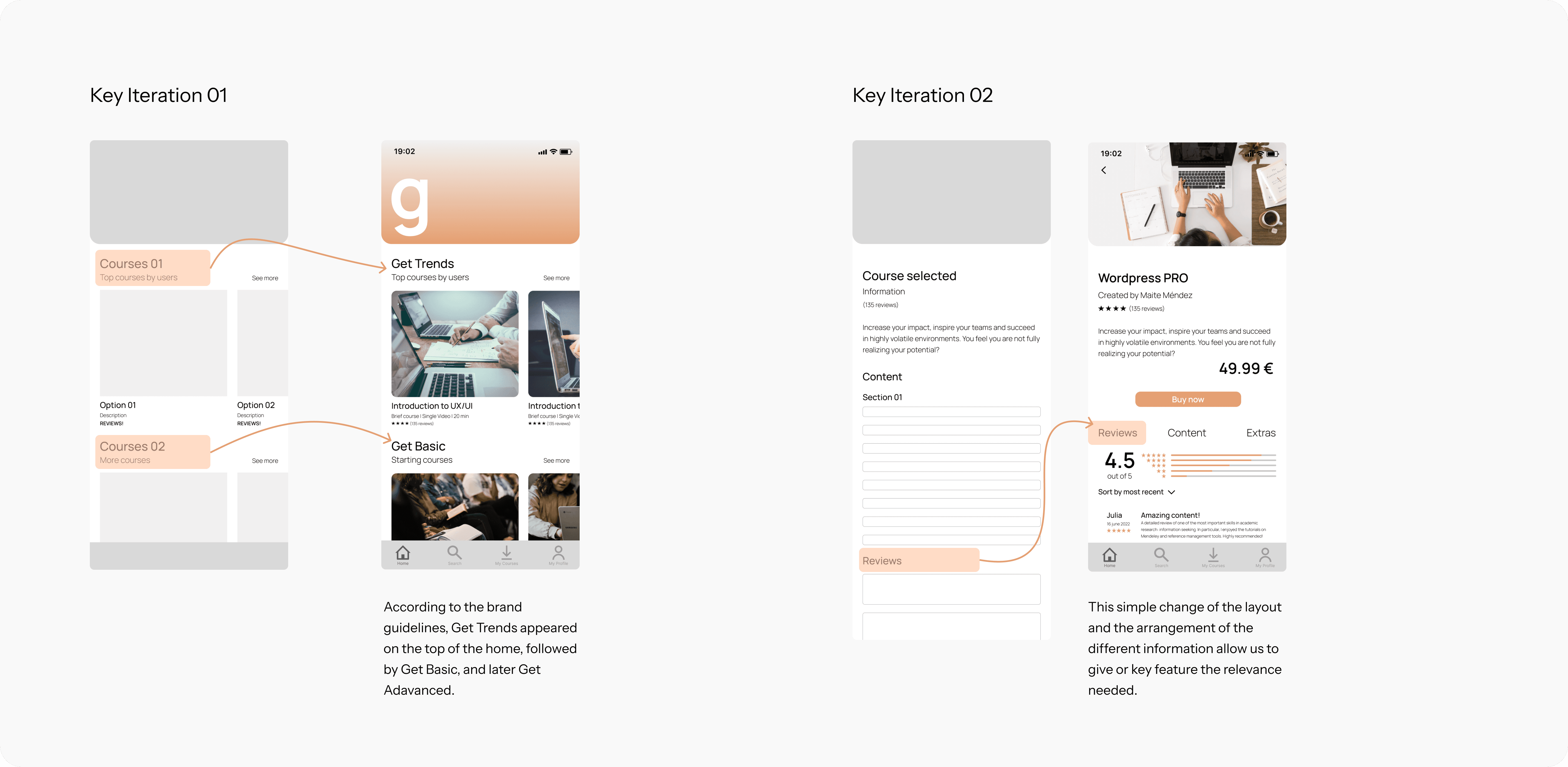
Key iteration 01
Initially, the homepage lacked any categorisation for the various courses displayed. During usability testing, users struggled to find specific courses they were looking for. This led to the idea of implementing general categorisation: 'Get Trends' (utilising the key feature of the app - Reviews) for highly recommended courses by other users; 'Get Started' for beginners; and 'Get Professional' for more advanced learning. Here, we integrated the product's branding with the different categories.

Key iteration 02
When a user entered a course they were interested in, the review section didn't have the importance that I've intended to give it. It appeared below the course description and content. I took the decision to made a change here, prioritising this item to make it more visible for the user.

Key Iterations

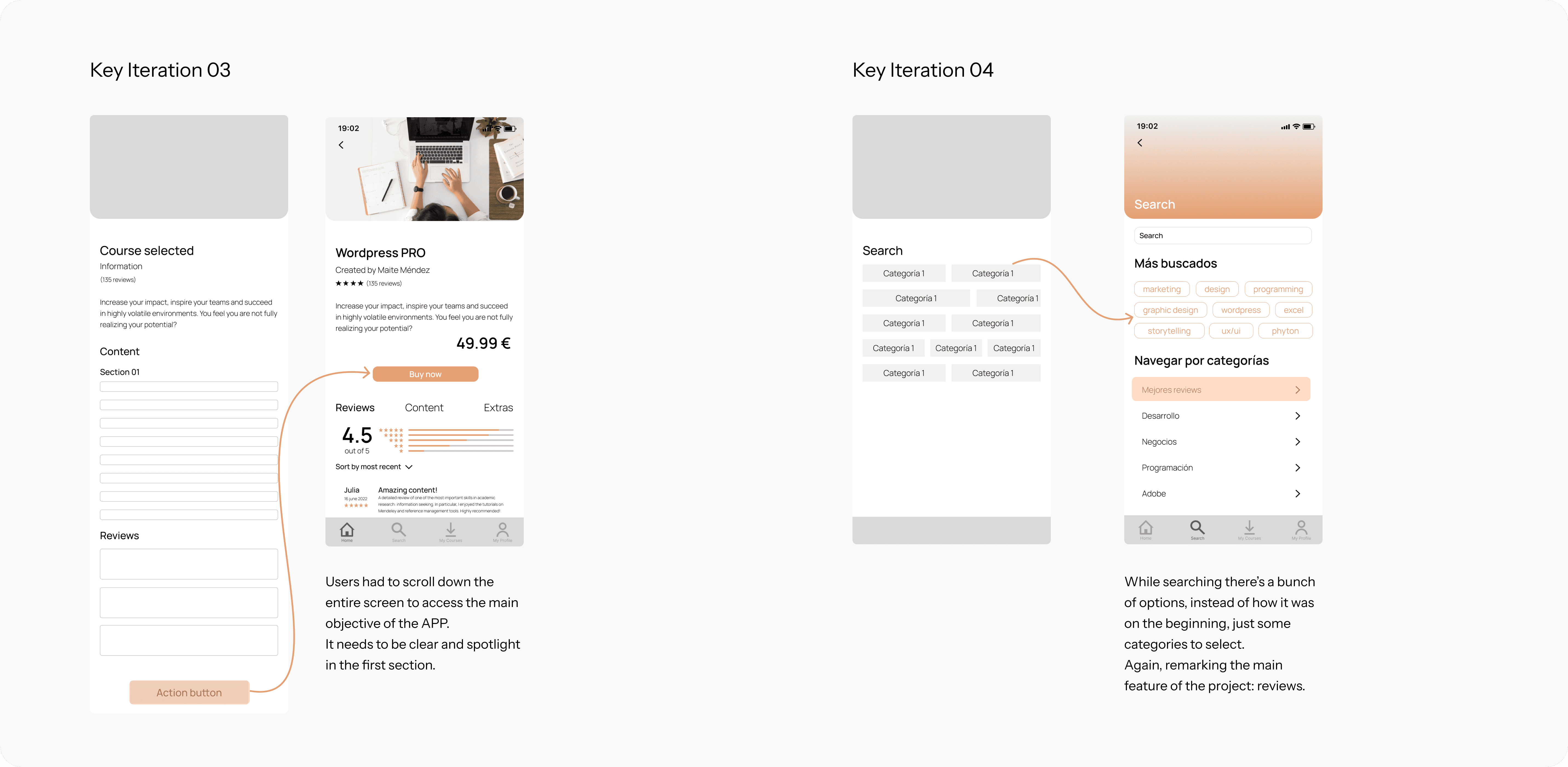
Key Iteration 03
Selling trustworthy content was one of the primary objectives of this project. During usability testing, users indicated that the main action, located at the bottom, didn't clearly showed the purpose of the app. Recognising this, I realised it needed to be highlighted. As for this, the screen structure was reorganised to make it more visibly prominent.

Key iteration 05
At first, the search section lacked a search bar, making it difficult for users to find what they were looking for. Instead, users had to scroll through categories to locate options. Feedback from users involved in usability testing suggested the inclusion of a search bar and the ability to search across different sections. Additionally, users emphasised the importance of highlighting the reviews section.

Review

As closing, here's the main features of the APP. Resumed, clear and following the main purpose of this project.