Research
Given that much of the research had already been completed by the time I joined the company, with the assistance of aging experts and a deep understanding of the business model, my task was to precisely define the approach and scope of this platform. Additionally, we needed to establish the levels of engagement and different accesses for the different stakeholders.

Employee side
After we had defined the three main roles that were going to perform with this product, the next step of this was to create the Retirement Readiness Assessment. Healthy ageing experts team develop and crafted a framework based and inspired by EF Framework.
This framework helped us to situate the different levels of readiness that the user could achieve while doing the assessment. (Framework and Final Assessment)
Following, we tried to map out how the entire journey of a regular employee would look like:
1 - Receiving the Retirement Readiness Assessment
2 - Completing the 80 questions of the seven domains
3 - Getting the general score
4 - Seeing the initial plan, generated based to two main questions on the first usage of the platform
5 - Entering to the platform for the first time
6 - Keep a daily/weekly use of it
7 - Using the mentor section (depending on the plan acquired by the company)
Here you can take a look of how this process looked like on the beginning.

Images
Following, we needed to plan out some of the screens, beginning with Mid-Fi, quick and basic prototypes. Providing context and reasoning, grayscale and initial shapes helped all of us understand how the employee journey would appear. It allowed us as well, to do usability testing with some of the company's we had as beta tester in the beginning, and some participants of the company as well.

Brand personality
Once we gathered some feedback from doing some rounds of usability testing, we planned the structure of this product trying to set the initial bases while doing a basic Design System. The most important components of the platform were developed, always following the brand book that we had, and as well thinking on accessibility and having on mind the type of users that we were designing for.

Brand personality
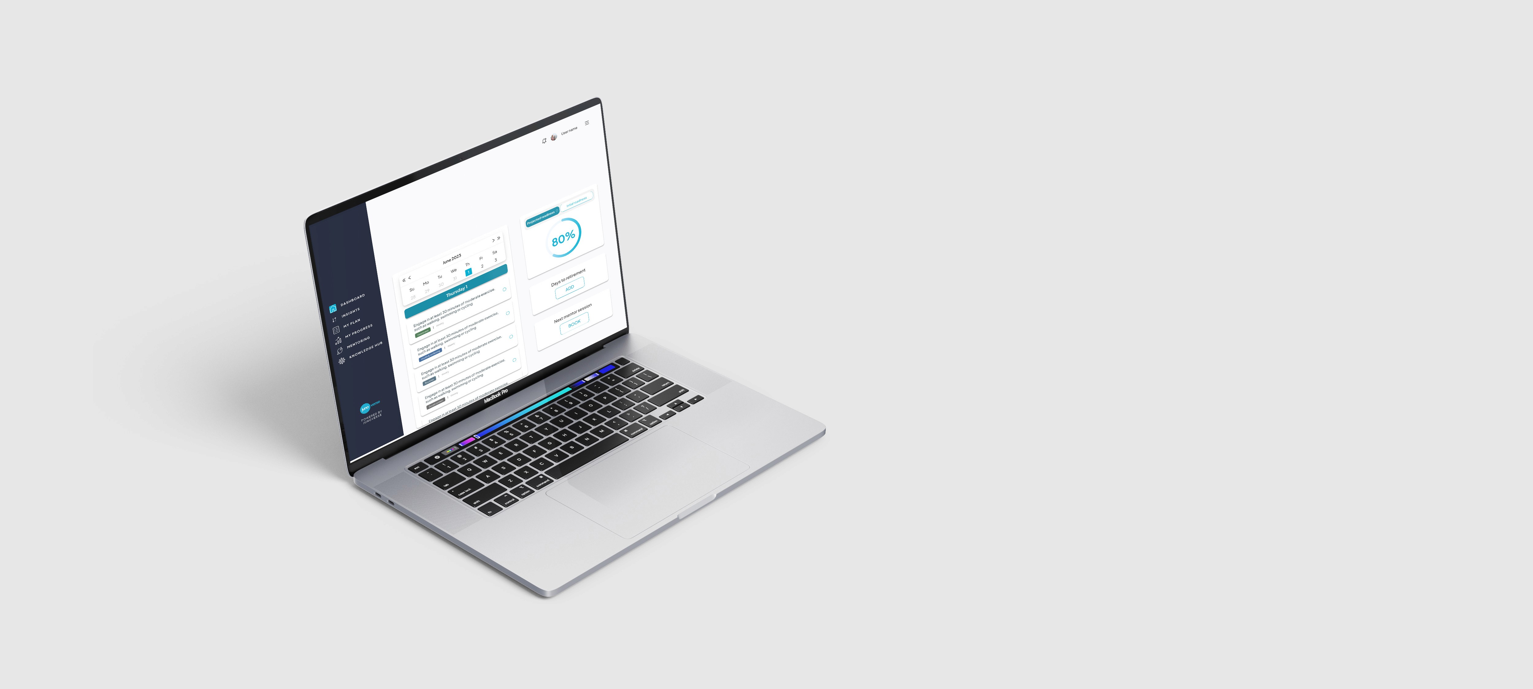
Here's one of the three main sections of the corporate employee platform:
Assessment framework
Home/Dashboard
My Progress
Employer side
In the case of the employer, the functioning of this platform was quite different, allowing this type of users reach out different actions.
The structure was divided into modules:
Home (to keep track of all the key elements of the company - Dashboard, Insights, Reports)
User Management (list of the entire company - groups of users)
Assessment (Retirement readiness - new surveys)
Settings (Sub-organisations, Roles and Permissions, Settings)
According to this different modules, here's the initial mapping of the main flow realised for the employer.
The design of the screens intended to follow the same logic for the employer as for the employee, but some elements needed a little bit of re-thinking, since they were not applicable.
Mentor side
The mentor side of the platform, maintain a structure quite similar to the employee, allowing the mentors to do the main tasks they needed. The mentors purpose was to provide support to the employees, since they already been on the transition into retirement, so they can share valuable and key insights about this experience.
Depending on the subscription the company acquired (Basic, Standard, Plus), there were different packages of mentoring sessions (2, 6, 12).
Home - upcoming sessions and agenda
Schedule - accept/decline and manage the upcoming sessions
Mentees - profile's and information
Working hours - setting the structure of the week


